One
Concern
As the Visual Designer for this climate-tech based startup, my day-to-day consisted of designing marketing and sales materials as well as crafting design assets to aid several other teams in the company, all while furthering One Concern’s visual branding. In this jack-of-all-trades position at a B2B and SaaS company, some deliverables I developed included an icon library, ebook, slide deck template, motion graphics, social media graphics, one-pagers, business cards, data visualizations, a data viz style guide, web page design, and case studies. I also worked on photo editing and video production, and occasionally aided the product design team.
This iconography system consists of two main styles to embody “resilience vs vulnerability.” The orange resilient icons have a solid ring to show protection. And their bright orange color does have a red gradient bleeding through to convey the idea of “resilience” to pressure, rather than the absence of pressures altogether. Alternatively, the broken ring design around the gray icons are intentionally imbalanced and uncomfortable in order to convey vulnerability. The gray color is used to represent ideas and technologies that are outdated and insufficient.
Iconography
One Concern’s mission was to facilitate planetary- scale resilience to natural disasters and climate change. Their messaging consistently revolved around the opposing concepts of resilience versus vulnerability. Their pitch decks would often build on these ideas with a variety of complex product features and terminology, so they needed a quick and reliable way to communicate these ideas.
Within the icon system and its several variations in style, I designed over 1000 icons to be used throughout the company. The subject matter ranged from simpler topics like roads and ports to more complex, niche topics such as damage ratio and scenario planning. This library also contains several specialized sets, such as the downtime set shown in the top row. The row starts with the original downtime statistic icon, and then shows variations for downtimes that are unique to each industry. And there were sometimes different style icons for the same topic to be used for different tones. For instance, the last two icons are both for earthquakes.
Presentation Design
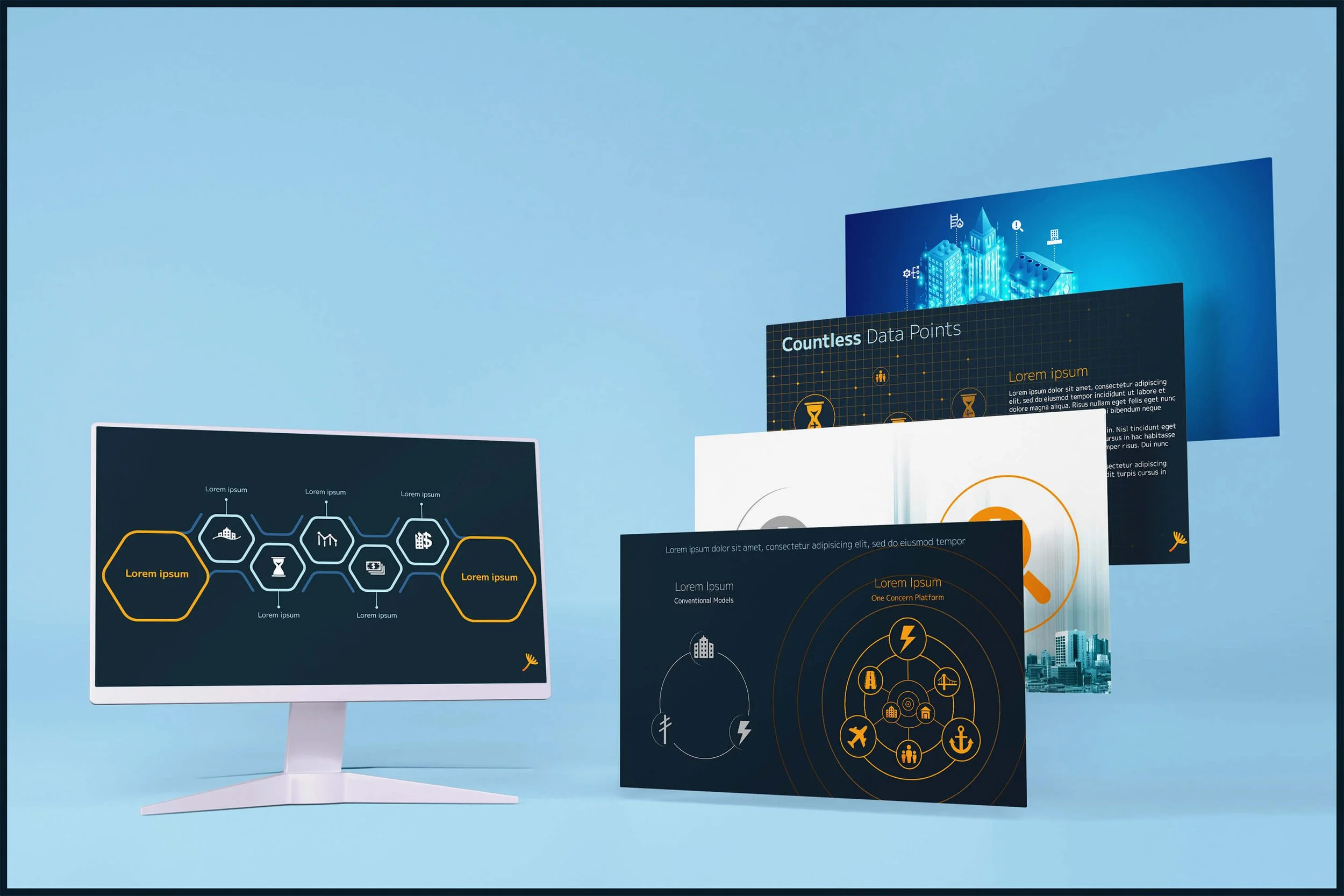
I developed a full slide deck template, equipped with 100+ sample slides, a photo library, guides for icon usage, and guides for overall usage. This deck was made to be used company-wide, from pitch decks to in-house presentations. The slides below show graphics utilizing the previously shown icon library in action.
Ebook
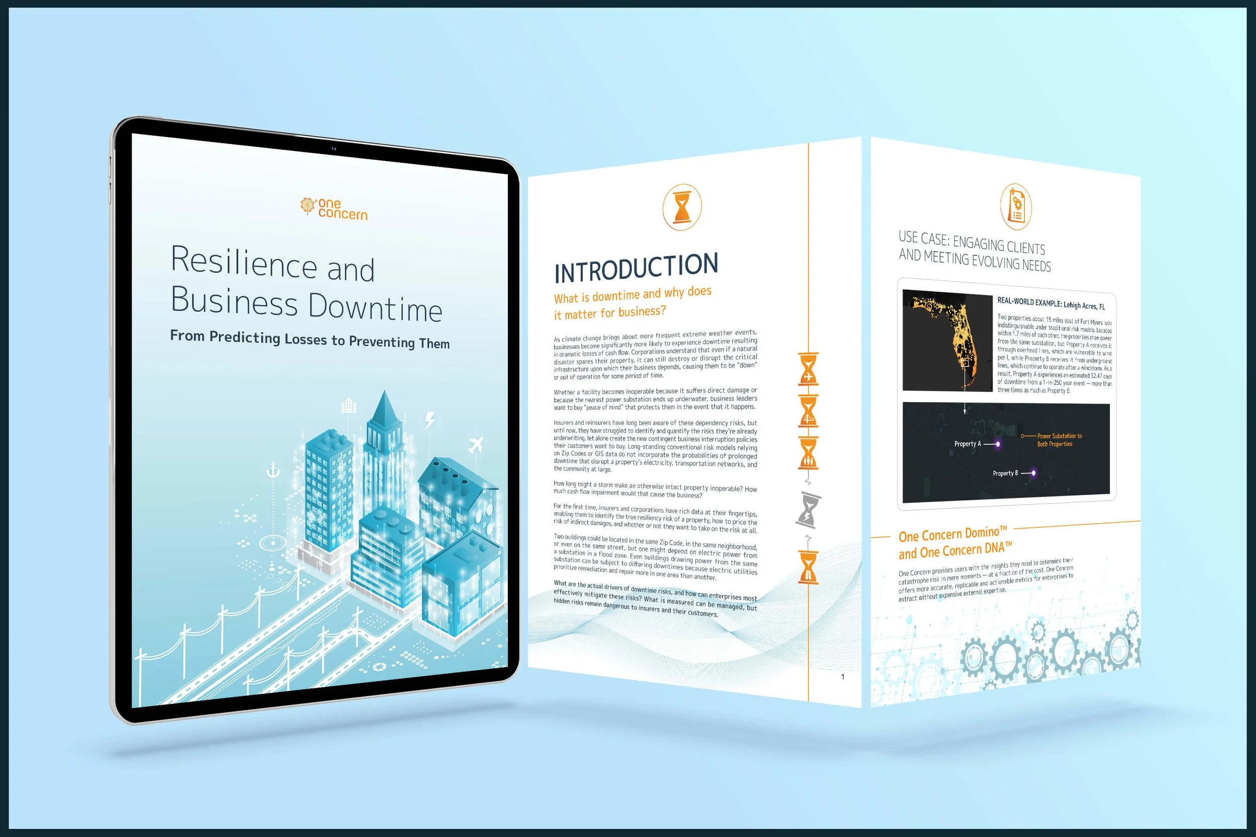
Lastly, I led the creative direction and fully designed One Concern’s 13 page ebook made to detail how climate disasters can cause major unexpected business downtime, and how One Concern’s platform can build resilience to this. The design concept for this ebook was digital protection for climate resilience and included previously mentioned graphics and icons.


